Introduction The given bar graphs display data on marriage and divorce during the times 1981 and 1994 in eight different nations. As can be seen from the presentation, the divorce rate has climbed in five out of the eight countries, …
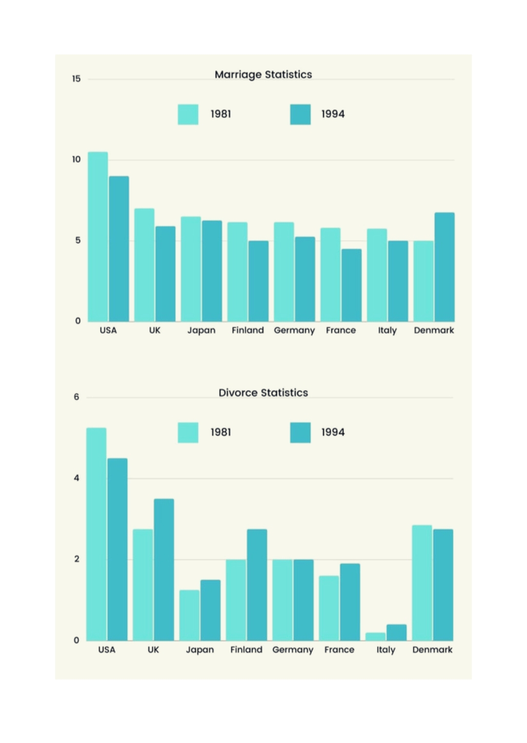
Introduction The given bar graphs display data on marriage and divorce during the times 1981 and 1994 in eight different nations. As can be seen from the presentation, the divorce rate has climbed in five out of the eight countries, …

Introduction The graph provides a data snapshot of the past, present, and future of global oil output in both OPEC and non-OPEC nations. These numbers show the expected oil production. While the number is anticipated to reduce in certain OPEC …

Introduction The first bar graph displays the nations that have participated in the winter Olympics and won the most medals. Also, it lists the total number of gold, silver, and bronze medals won by each nation. The second graph, on …

Introduction Together, the two tables provide an overview of why people decide to stop smoking and when they plan to do so. Body paragraph 1 The top two reasons given by smokers for quitting are their overall health (71%), followed …

Introduction The given bar chart shows data regarding the number of employees who worked in various tourism-related industries between 2009 and 2019. Overall, it is evident that growth is occurring, except for the cultural sector. Body paragraph 1 According to …

Introduction The chart shows the differences in the average distance traveled by a person by various means of transportation in the Netherlands between 2001 and 2006. Overall, commuters in the Netherlands made more trips in 2006 than they did in …
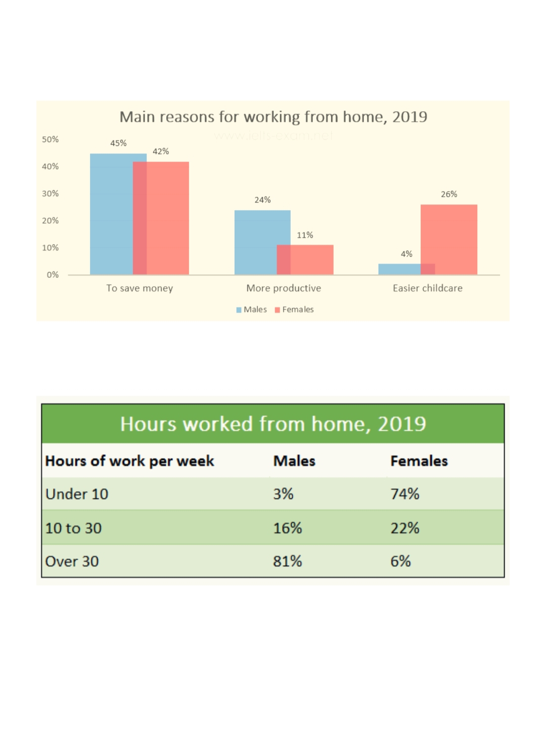
Introduction In the given figures, a comparison of the main factors that male and female employees in 2019 opted to work from home is shown, along with the number of hours they put in each week. Overall, it is evident …

Introduction The diagram shows the process of turning raw materials into rough paper and refined paper. Overall, it is evident that pulp production from raw materials is a four-stage procedure. Then it goes through more processing to become paper. Body …

Introduction The pie charts show the world consumption of four different types of food in 2008, including China and India. Overall, processed food was consumed at a higher rate than other types of food, and Chinese people consumed the most …

Introduction The graph depicts the frequency of three different types of vehicles—vans, trucks, and tricycles—on a road at varying times of the day. Body paragraph 1 To start with, the graph makes it evident that, at any given time, vans …